How Our Insights Boosted Monthly Revenue by 12%

Purpose
Our client is a manufacturer and distributor of hardware products and sells those products via their E-commerce website as well. They have collected a wide variety of data over the course of decades but had little knowledge about how they can use this data to its dollar value. We took the initiative and implemented in-depth quantitative analysis, machine learning, and data visualization. We came up with the insights, which according to our predictions, will bring at least 12% growth in the month-to-month revenue.
Dataset
Been in the business for decades, the client had an immense opportunity to collect data via different sources. We have concentrated majorly on the below four sources which have little to no scope of data corruption. We have merged these isolated sets of data to give us insights that will help the client to grow his revenue.
Google Analytics
Google Adwords
CRM
Kentico
Insights
The core reason behind this project is to have better CPC and CTR value so that we could run an optimized PPC campaign which will bring more revenue with the same budget.The main study that we have done revolves around Google Adwords, however, it was also very important to realize and use other data aspects such as those related to user quality, features and demographics.
One of the most important KPI is Users.
By tracking the performance of this metric, we get time-series data.
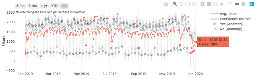
- It’s clear that there is a day-of-the-week effect. To remove this effect, use a 7-day rolling average. Then we can explicitly see the moving trend of Users.
- Anomaly Detection is a commonly used method in time-series analysis. Orange points in this plot are identified as anomaly points by using Anomaly Detection (STL + IQR methods for the situation that seasonality is not a major factor). Grey area covers 95% of all data points. Points out of this area are identified as anomalies.
- For each anomaly point, we will break Users down to several segments to figure out which specific part has caused this positive/negative change. This can help with decision making in the next step. For example in 2019-07-04, we only had 673 Users which was below the minimum. After comparing the Cost Composition Trend, we figured out that the cost/budget had a reduction in 2019-07-04, which also shows that PPC really drives the website traffic.
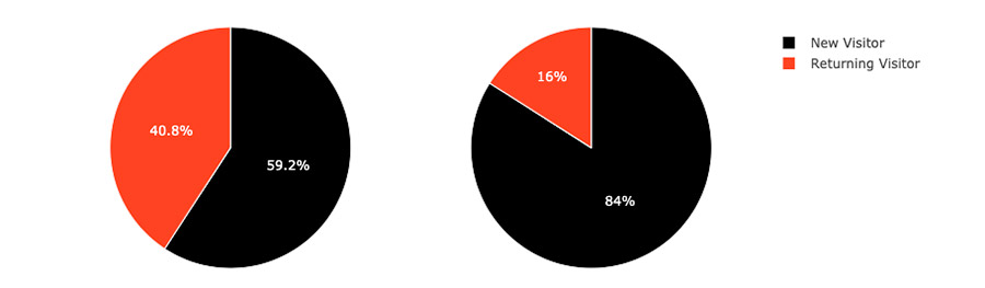
One of the User insights was that the Converters segment shows a much higher percentage (40.8%) of Returning Visitors than the Non-Converters segment (16%).
Analysis: If this happens, it implies that the decision to convert span needs multiple sessions. It could also indicate that the e-commerce loyalty program and email marketing efforts were successful in targeting existing users and getting them to return to the site. On digging in deeper, we figured out that it takes multiple sessions to reach a decision point when the session is initiated by an employee with no buying power and is someone who will recommend the product to his/her manager/supervisor. It also tells us that retargeting will be one of the best strategies for this particular business. (This insight refers to Google Analytics Academy. For this pie chart, it only visualized data from 2019-01-01 to 2019-03-31)
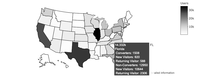
Geographic data
It can also be used to identify the most profitable area of marketing.
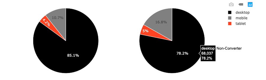
The other and most important insight was in regards to devices and browsers.
Our data visualization made it very clear that, although users browse on mobile and desktop devices (Converters: 10.7% + 85.1% = 95.8%, Non-Converters: 16.8% + 78.2% = 95%), Converters mainly use Windows desktop devices and Bing as a browser.
Since the mobile usability tested positive against responsive testing, it indicates that purchases like this are searched by employees with no buying power. However, it also shows that they are the ones who make recommendations to the higher authorities in the office and they are the ones who place the order. Which aligns with our previous hypothesis. (For this pie chart, it only visualized data from 2019-01-01 to 2019-03-31)
We have done further research on users’ data which added more insights to the above section and helped our client use all of this information to come up with a better strategy.
Moving on to the most important dimension where all the hidden answers exist which is PPC.
PPC (Pay-per-click)
For PPC insights in this case study, we have only used data from Google Adwords for the period of 2019. Here is an example of the data visualization that we have done to better understand data distribution and data points.
Consistent monitoring of KPIs, experimenting with new tactics and making comparisons are key points for getting insights for PPC decision making.
Cost Compositions: Clicks & CPC Daily Trend for All Campaigns’ Data
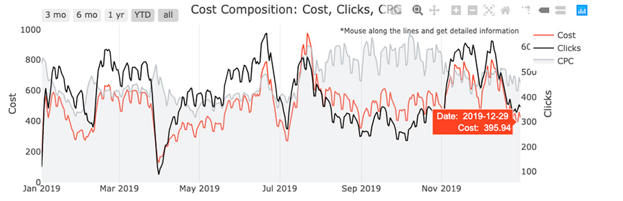
- It’s clear that there is a day-of-the-week effect on these 3 metrics: Cost, Clicks, CPC. To remove this effect, use a 7-day rolling average.
- Next, we want to figure out if there is something that might drive themoving ofClicks. For this purpose, we focus on several campaigns to get insights -going_down, going_up and flat CPC trends.
Campaign Clustering by the trend of CPC
We want to cluster campaigns by CPC trending because CPC implicitly tells the performance of PPC. Here is the Sunburst Charts for Campaigns (w/ Clicks & Cost share) clustered by CPC trends.
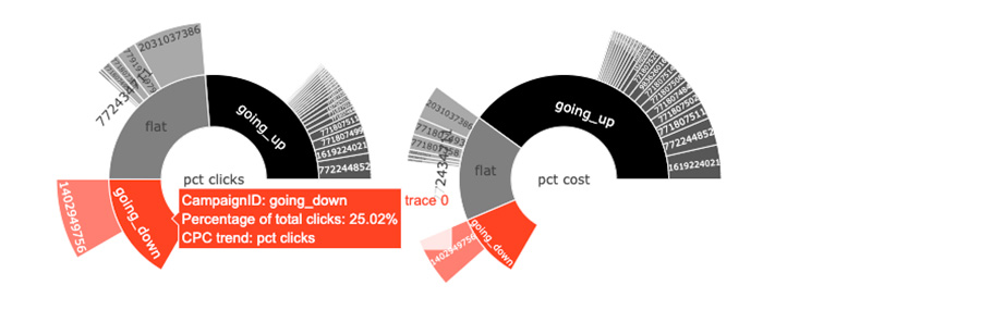
- Campaigns with going up trends generate 39.46% of the PPC clicks and consist 59.99% of ad cost.
- Campaigns with flat trends generate 35.52% of the PPC clicks and consist 24.6% of ad cost.
Next, we pick the highest clicks campaign in each cluster and analyze their performance by monitoring Cost, Clicks and CPC.
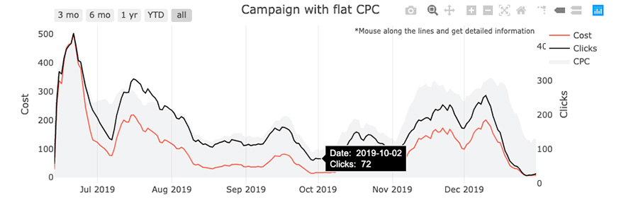
Top Clicks Campaign & Cost Composition Trends
- The following plots show the basic strategy behind how we made data-driven decisions by tracking key metrics for PPC.
- Notice: Gaps in the following plot mean the stop of this campaign.
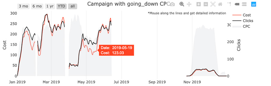
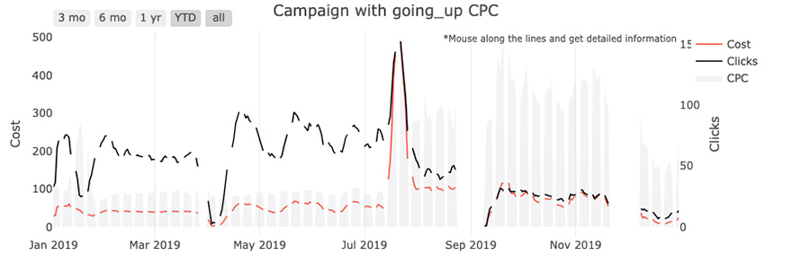
- As you can see, after CPC gets optimized it tends to flatten. Upon increasing the budget (cost), the number of Clicks will increase and keep a stable trend. If CPC increases, we can investigate and optimize further.
- By keeping the same amount of budget and tracking CPC, we can gain insights into the performance of our ad campaign optimization. Then, we will get back to our content team to optimize quality score. That’s the reason why we want to track and optimize CPC.
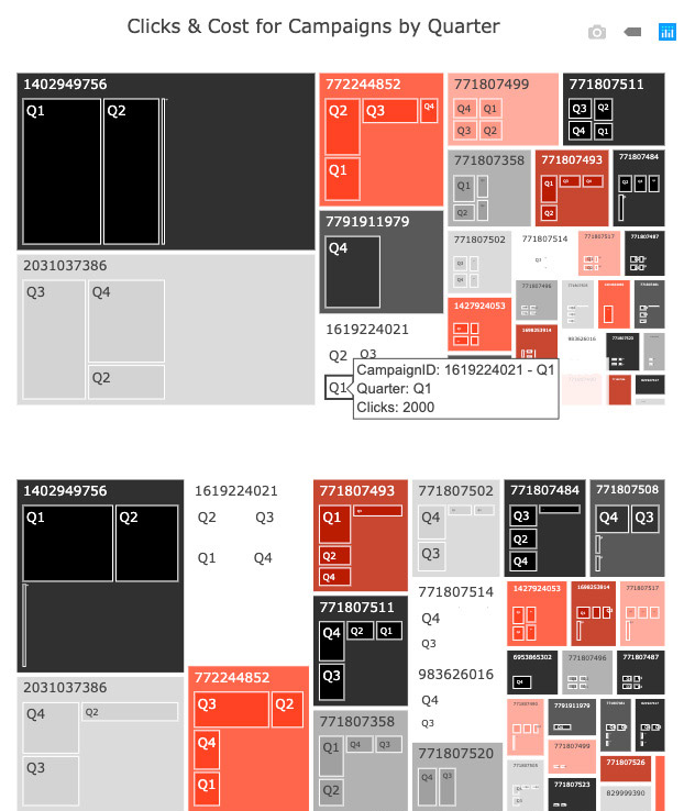
Campaign Performance Metrics
Clicks & Cost: Treemap
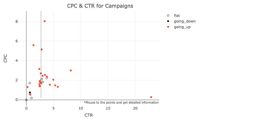
CPC and CTR
In order to compare the campaign performance, we have to look at campaign groups by CPC trends.
“Smartboost team is extremely customer-oriented, always on point in terms of understanding our needs and delivering what we expected. They help us to generate comprehensive and actionable data visualization from past data, CRM, Kentico and Google Analytics.”

Sarah
Vice President
 Takes 2 min